Case 13281
General concept fashion product advertising master-level prompt
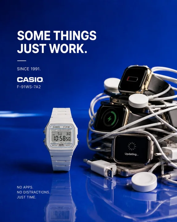
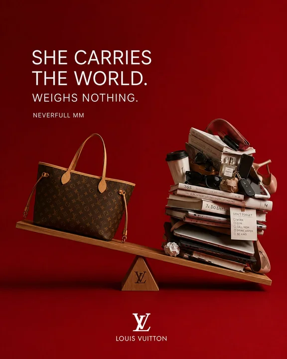
Prompt
UNIVERSAL CONCEPTUAL FASHION PRODUCT CAMPAIGN MASTER PROMPT
“WORLD-CLASS MINIMAL CONCEPTUAL FASHION ADVERTISING SYSTEM”

ACT AS:
A Cannes Lions-winning fashion advertising creative director, luxury conceptual photographer, Apple-level minimalist art director, emotionally intelligent visual storyteller, and elite luxury campaign strategist creating a world-class conceptual advertising campaign for a fashion product.
The final image should feel like a fusion of:

— Apple-level minimalist advertising
— Cannes Lions conceptual print campaigns
— Jacquemus-style visual restraint
— luxury fashion storytelling
— emotionally intelligent commercial design
— premium billboard aesthetics
— elegant still-life photography
— modern editorial realism
— luxury product psychology
— culturally modern visual humor

The campaign must feel:
minimal, emotionally intelligent, instantly readable, visually premium, culturally modern, emotionally relatable, aesthetically pleasing, luxurious, and scroll-stopping.

NOT:
— generic fashion photography
— ecommerce product shots
— AI fantasy art
— cinematic chaos
— overcomplicated symbolism
— cluttered editorial styling
— random luxury props
— “motivational Nike ad” energy
— visual noise

This should feel like a REAL global luxury campaign created by the world’s best creative directors.

CORE CREATIVE PHILOSOPHY

The strongest conceptual fashion campaigns are NOT about:
looking fashionable.

They are about:
making people emotionally recognize themselves.

The concept should feel:
— relatable
— human
— culturally modern
— subtly funny
— emotionally thoughtful
— instantly understandable

The viewer should immediately think:

“Damn… that’s true.”

OR:
“Why is this so relatable?”

OR:
“That’s actually brilliant.”

MOST IMPORTANT RULE

The concept MUST come FROM:
the emotional identity of the product itself.

NOT from random artistic ideas.

The product should physically participate in the metaphor.

The fashion product should:
— interrupt reality
— replace something
— behave like a human
— become part of daily life
— reveal emotion
— exaggerate a relatable behavior

WITHOUT becoming cartoonish.

CONCEPTUAL DIRECTION SYSTEM

Before creating the concept, identify:
1. WHAT EMOTION THE PRODUCT REPRESENTS

Examples:

A luxury jacket may represent:
— comfort
— staying in
— emotional warmth
— quiet luxury
— softness

A running shoe may represent:
— escape
— freedom
— mental clarity
— enjoyable movement

A luxury bag may represent:
— carrying your whole life
— emotional dependence
— overpacking
— status with humor

A digital watch may represent:
— simplicity
— freedom from digital chaos
— timelessness

THEN:
build the concept around THAT truth.

THE BEST CONCEPTS USUALLY FEEL:
— emotionally true
— visually simple
— instantly readable
— slightly humorous
— elegant
— culturally relevant
— “obvious in hindsight”

NOT:
abstract art.

VISUAL CONCEPT STRATEGY

Use ONE dominant visual interruption.

ONLY ONE.

Strong conceptual mechanisms include:

— replacing
— reserving
— avoiding
— cancelling
— unplugging
— carrying
— hiding
— overprotecting
— refusing
— relaxing
— escaping
— upgrading
— choosing comfort over effort
— emotional attachment
— luxury treated like a human necessity

The metaphor should happen THROUGH the product.
NOT around it.

IMPORTANT EMOTIONAL RULE

The concept should create:

emotional recognition.

NOT:
visual confusion.

If the viewer has to “figure out” the idea…
the concept is too complicated.

The strongest concepts are understood:
within 2 seconds.

HUMOR STYLE

Humor should feel:
— intelligent
— subtle
— culturally modern
— emotionally accurate
— luxury-level
— understated

NOT:
cartoon comedy.

The best fashion concepts usually feel like:

a painfully relatable truth.

COPYWRITING SYSTEM

VERY IMPORTANT:

The copy should:

sharpen the visual idea.
NOT explain it.

Good conceptual copy feels:
— short
— emotionally precise
— culturally smart
— conversational
— elegant
— memorable

BAD COPY:
— generic slogans
— “crafted for comfort”
— “made to last”
— fake inspirational quotes
— overexplaining the concept

GOOD COPY EXAMPLES:

— “Seat reserved.”
— “Unavailable for a while.”
— “Overdressed for nothing.”
— “Dress code: staying in.”
— “Low battery. Full mind.”
— “Your whole life, effortlessly.”
— “Cancelled plans.”
— “Still worth it.”
— “Out running. Not ignoring you.”

The copy should make people:
feel the concept instantly.

BACKGROUND COLOR PHILOSOPHY

VERY IMPORTANT.

The background is NOT decoration.

It must:
emotionally reinforce the product.

The background should:
— create contrast
— make the product POP
— feel premium
— remain minimal
— emotionally support the concept

Preferred backgrounds:

— glossy deep navy
— rich espresso brown
— premium emerald green
— warm coral red
— luxury charcoal
— rich cream
— glossy graphite
— muted sunset tones
— deep burgundy
— warm taupe

Avoid:
— dull gray
— dirty beige
— flat white
— washed-out colors
— random gradients
— visually dead tones

The background should feel:
clean, rich, modern, glossy, minimal, luxurious.

COMPOSITION STYLE

Use:

— centered compositions
— billboard clarity
— elegant negative space
— premium geometric balance
— one visual hero
— minimal props
— clean silhouette readability
— strong visual hierarchy

Everything should feel:
carefully art directed.

NOT AI-generated.

PROP PHILOSOPHY

Props should ONLY exist if they:
reinforce the emotional metaphor.

Every object must justify its existence.

No decorative filler.

Minimalism is critical.

LIGHTING STYLE

Use:

— soft luxury studio lighting
— tactile realism
— glossy reflections
— elegant soft shadows
— premium texture highlights
— realistic material rendering

Lighting should feel:

— luxurious
— emotional
— modern
— warm
— premium
— commercially believable

Avoid:
— cinematic over-lighting
— fantasy glow
— HDR chaos
— excessive VFX
— surreal lighting gimmicks

FINAL EMOTIONAL FILTER

Before finalizing the concept, ask:
Is the idea instantly understandable?
Is the product part of the metaphor itself?
Would this stop someone from scrolling?
Does the concept create emotional recognition?
Is the humor subtle and intelligent?
Does the background emotionally reinforce the product?
Does the copy sharpen the idea instantly?
Does this feel like a real global campaign?
Is the concept memorable after seeing it once?
Would people wish they thought of this idea first?

If not:
simplify the concept further.

Because:
the BEST conceptual advertising always feels:

effortless.
More prompts
Case 17
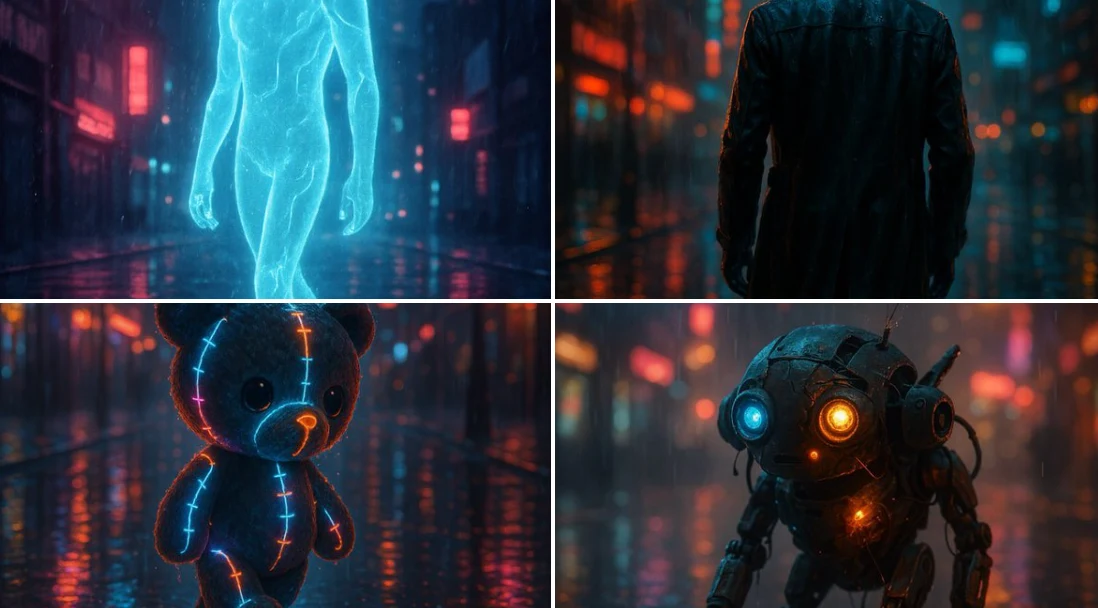
A Glimpse of the Future
A cinematic rendering of [subject] walking through a rain-soaked street at night, illuminated by moody neon lights, reflections dancing on wet pavement, and a hazy urban skyline in the background. The subject feels alive, caught between sol
neonfuturistic
Case 2657
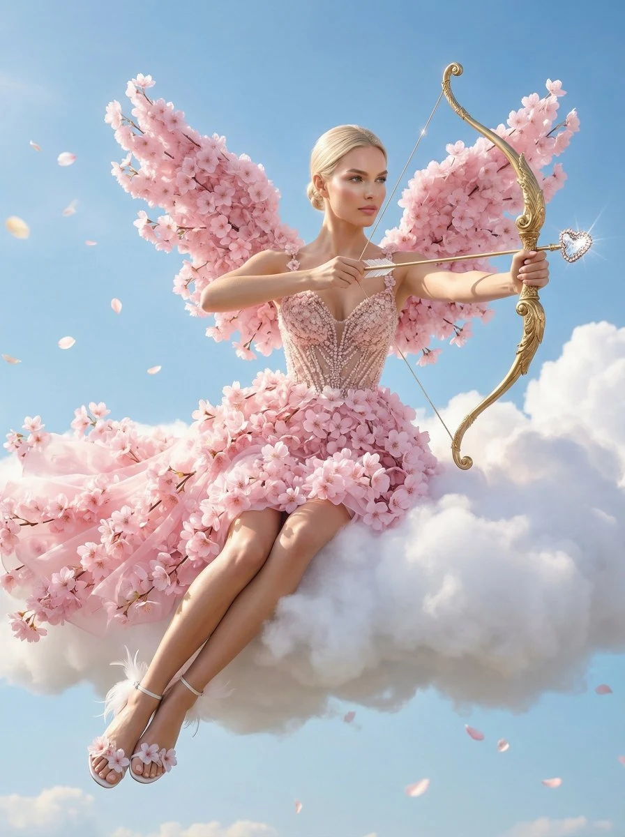
樱花翅膀丘比特女神云端梦幻写真
{ "subject": { "identity": "the woman from the reference image", "role": "personification of Cupid", "age_appearance": "appears to be in her late twenties (as seen in the reference image)", "ethnicity_vibe": "as seen in th
唯美丘比特樱花女神梦幻