Case 13267
Trendy toy quirky IP wordmark logo design generation guide
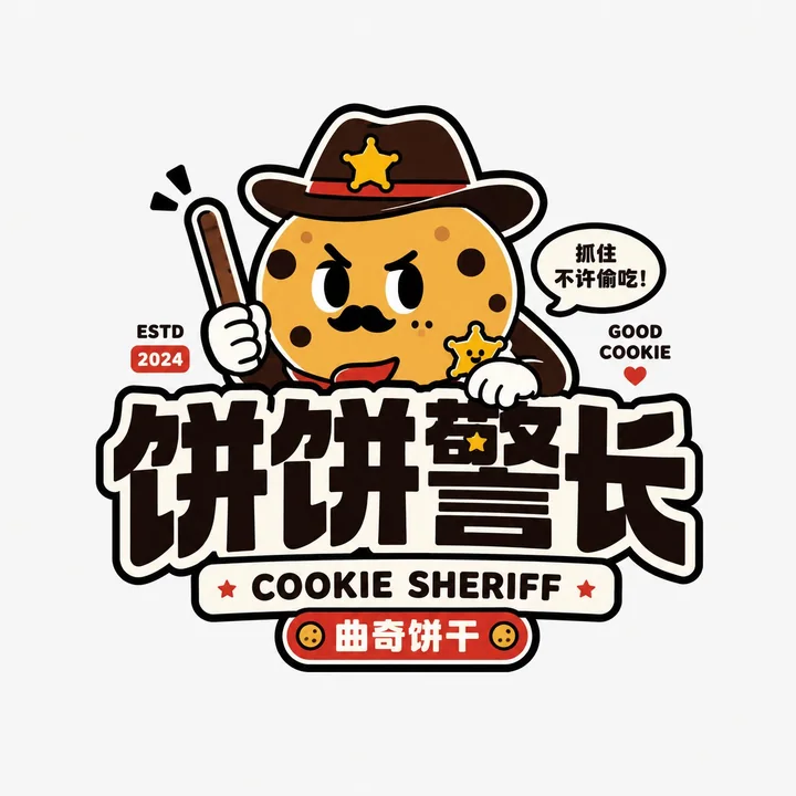
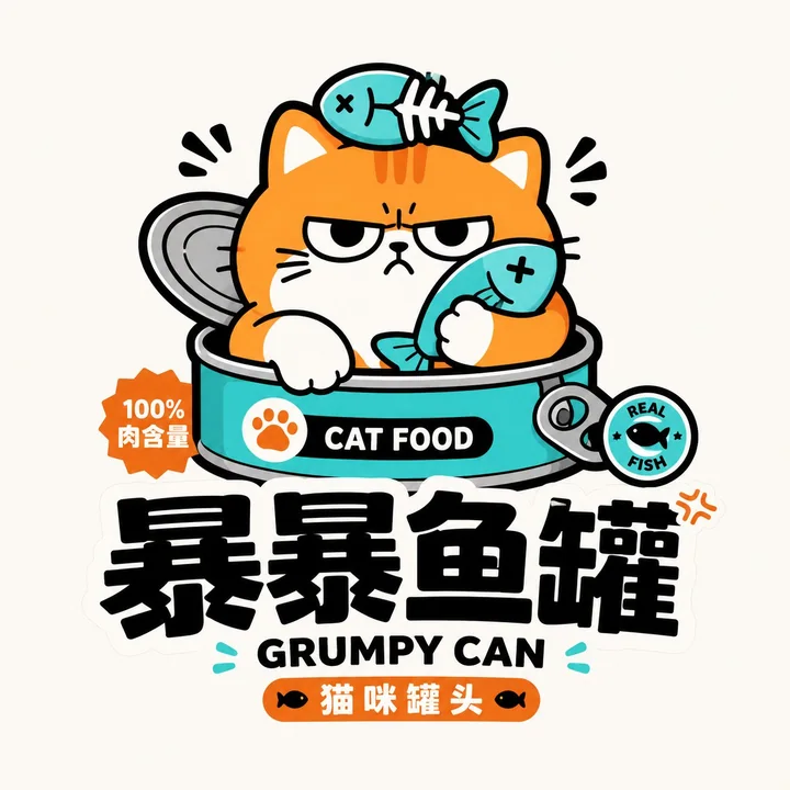
Prompt
Please design a high-completion “Trendy Toy/Quirky IP Wordmark Logo” based on the user’s input for [Brand Name / Project Name], [Subtitle / Product Name], [Type / Industry], [Brand Positioning], [Core Keywords], [Character Setting], [Emotional Tone], [Primary Color], [Secondary Color], and [Aspect Ratio].

[User Input]
Brand Name / Project Name: [Brand Name / Project Name]
Subtitle / Product Name: [Subtitle / Product Name]
Type / Industry: [Type / Industry]
Brand Positioning: [Brand Positioning]
Core Keywords: [Cute, quirky, trendy toy, sticker feel, youthful, IP feel, funny, imaginative, adorably goofy, brand feel, etc.]
Character Setting: [Animal / Anthropomorphic object / Quirky character / Food character / Space character / Trendy toy character, etc.]
Emotional Tone: [Adorably goofy, grumpy-cute, silly-cute, neurotic, happy, lazy, tsundere-cute, absurd, light trendy, etc.]
Primary Color: [Primary Color]
Secondary Color: [Secondary Color]
Aspect Ratio: [Aspect Ratio]

[Core Goal]
This time, the task is to design a truly brand-recognizable “Trendy Toy/Quirky IP Wordmark Logo.” It is not an ordinary children’s cartoon or a simple illustration. Instead, it should integrate “character + wordmark + color + sticker-style composition” into one complete logo. The final result should feel like a youthful trendy-toy logo that can be directly used for packaging, stickers, social media avatars, storefront signage, merchandise, and the main brand visual mark.

[Design Essence]
The focus of this type of logo is not just drawing a cute character, but achieving the following integration:
1. A highly recognizable, quirky, and adorable core character;
2. A bold, eye-catching, heavy black Chinese wordmark;
3. Auxiliary English title or subtitle to enhance the trendy-toy packaging feel;
4. High-saturation flat colors with bold black outlines;
5. The overall look should resemble a sticker, trendy toy packaging, or an IP brand mark, rather than a regular illustration.

[Most Important Principles]
1. The character must be the main memory point, but it cannot be merely decorative;
2. The text must be clear and function as a logo;
3. The character and wordmark must interact and form a unified whole, not just be stacked vertically;
4. The style must feel youthful, quirky, and shareable, not childish or tacky;
5. It must have a “sticker feel, trendy-toy feel, IP feel,” not a traditional corporate logo feel;
6. The color palette must be bright, bold, and memorable;
7. The image must be clear, simple, and complete, suitable for small-size applications;
8. Chinese and English may be mixed, but the Chinese or brand name must be clear and eye-catching.

[Character System Requirements]
Please design a quirky, adorably goofy, audience-friendly cartoon character around the [Character Setting]. Characters may include:
- Anthropomorphic animals: cat, dog, bear, monkey, rabbit, fish, crocodile, etc.;
- Anthropomorphic objects: milk carton, cookie, beverage, toothpaste, cake, spaceship, weapon, tool, etc.;
- Hybrid characters: animal + food, animal + object, food + expression, monster + toy, etc.

Character requirements:
1. The shape should be simple, exaggerated, cute, and interesting;
2. The expression must be memorable, such as blank, smug, silly, lazy, mischievous grin, grumpy-cute;
3. It should have a strong silhouette suitable for a brand mark;
4. It should include a bit of imagination or contrast;
5. Keep the lines as simple as possible, flat in style, not realistic;
6. The character may hug, hold, sit on, lean on, peek out from, or press down on the wordmark;
7. The character should directly participate in the logo composition, not stand separately on the side.

[Wordmark System Requirements]
1. The Chinese brand name or main title must stand out;
2. The font should be thick, black, and weighty, like packaging headline fonts or trendy-toy brand fonts;
3. Slight deformation is acceptable, but do not make it overly ornate;
4. It should work well with interweaving, overlapping, wrapping around, or combining with the character;
5. English may be used for arched headings, auxiliary titles, secondary descriptions, short slogans, years, etc.;
6. The English style may lean toward bold, uppercase, toy-packaging feel, sticker feel;
7. The overall hierarchy should form a complete system of “character + large Chinese text + auxiliary English.”

[Composition Requirements]
The overall composition should have a clear “trendy toy sticker logo” feel. Possible structures include:
1. Character on top, Chinese wordmark below, with small English text as support;
2. Character pressing on the text or peeking out from the text;
3. Arched English at the top + character in the middle + Chinese wordmark at the bottom;
4. Character and text forming one overall outline, like a brand sticker;
5. Small labels, years, symbols, or stamps may be added to enhance the packaging feel.

Overall requirements:
- Centralized subject;
- Clear structure;
- Explicit relationship between character and text;
- Easy to recognize when scaled down.

[Visual Style Requirements]
1. Use flat color blocks;
2. Use obvious thick black outlines;
3. The color palette should be high-saturation and impactful;
4. The overall look should feel like a trendy toy, sticker, and packaging;
5. The image can have a touch of absurdity and humor;
6. Lines should be clean and crisp, without complex shadows;
7. No realistic materials, no 3D realism.

[Color Requirements]
It is recommended to use 2–5 main colors, with an overall high-saturation, youthful look.

[Auxiliary Element Requirements]
A small amount of trendy-toy packaging-style supporting elements may be added, but they must be restrained and should not turn the image into a poster.

[Visual Presentation Requirements]
1. This is a standalone logo presentation image, not a poster;
2. The background should be clean; white, light gray, or off-white is recommended;
3. The main subject should be clear and complete, with the character and wordmark integrated;
4. The style should be consistent and highly recognizable;
5. Suitable for packaging, avatars, stickers, signage, merchandise, and social media distribution.

[Acceptance Criteria]
Please ensure the final result meets the following:
1. The character is memorable at first glance;
2. The brand name is clear at first glance;
3. The character and wordmark form one cohesive whole;
4. The overall look has sticker feel, trendy-toy feel, and IP feel;
5. The color palette is bright, youthful, and broadly appealing;
6. It is suitable as a main brand logo, not just a simple illustration;
7. It has strong shareability and social-media friendliness.

[Output Requirements]
Please output a high-completion “Trendy Toy/Quirky IP Wordmark Logo” that uses a quirky and adorable character as the core, a thick black wordmark as the structure, and high-saturation flat colors with sticker-style composition as the visual language, forming a youthful, trendy, shareable, and brandable complete logo.
More prompts
Case 14861
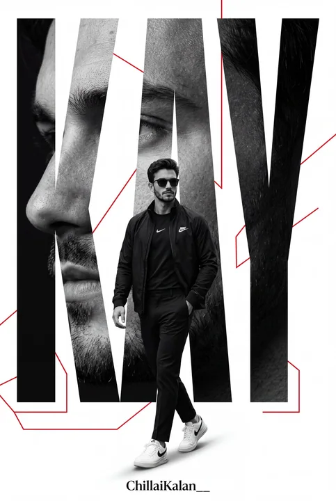
Minimalist high-end Nike sporty poster design
Create an ultra-premium minimalist sports poster featuring a confident man matching the reference image, using the same face, walking forward in an elegant all-black Nike outfit: a black Nike jacket, Nike shirt, tailored trousers, and white
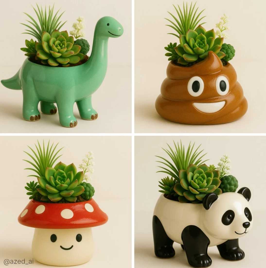
Case 19
Emoji becomes a flower pot
A high-quality photo of a cute ceramic [object/animal]-shaped planter with a glossy finish, filled with a variety of vibrant succulents and greenery including a spiky Haworthia, a rosette-shaped Echeveria, and delicate white flowers. The pl
minimalistnaturephotographyanimalemoji