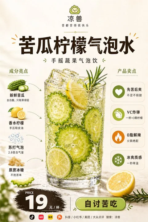
Case 11200
Restaurant brand commercial promotional poster
品牌设计美食海报商业推广成分说明餐饮广告
Prompt
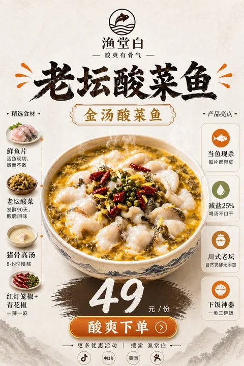
Based on the food image uploaded by the user, create a highly polished "Food Hero Explainer Poster" suitable for social media publishing and food brand promotion.

【User Input】
Brand Name: [Enter Brand Name]
Brand Subtitle / Slogan: [Enter a Short Slogan]
Product Name: [Enter Product Name]
Product Category: [Fast Food / Main Dish / Beverage / Dessert / Local Cuisine / Baking / Light Meal / Other]
Left Ingredient List: [Enter 4–6 Main Ingredients, Each with a Short Description]
Right Selling Point List: [Enter 4–5 Nutritional or Product Selling Points, Each with a Short Description]
Price: [Enter Price]
Price Unit: [Per Serving / Per Cup / Per Box / PER SERVING / PER CUP / PER BOX]
Button Text: [Order Now / Buy Now / Place Order Now / ORDER NOW / BUY NOW]
Bottom Guide Text: [e.g.: More New Products | Promotions | Brand Updates / Get New Product and Discount Info / Follow for More Benefits]
Bottom Platform Icon Combination: [e.g.: Douyin + Xiaohongshu + Video Account + Official Account; or Douyin + Xiaohongshu + Meituan + Dianping]
Bottom Search Guide: [e.g.: Search Across All Platforms: Brand Name / Search Brand Name: XXXX]
Accent Color: [e.g. Orange / Red / Golden Yellow / Green / Strawberry Pink / Black Gold Orange]
Aspect Ratio: [Portrait 2:3]

【Core Reference Rules】
Image A is the main food reference image uploaded by the user, and also the core main visual basis for this poster.
Must strictly preserve the food's type, main appearance, overall structure, core plating method, main ingredient expression, color tendency, and realistic texture.
Do not replace this dish with another food, do not regenerate a different dish, do not change to a different plating logic, do not make the food look distorted.
While maintaining consistency of the main subject, moderately optimize lighting, clarity, shadow layers, spatial sense, and commercial photography texture to make it look more like professional food photography in high-end restaurant advertisements, but cannot change the product itself.
The key point is: preserve the original dish's recognizability, only upgrade the poster packaging, layout design, and overall visual presentation.

【Overall Positioning】
This is not an ordinary menu image, nor purely food photography, but a commercial promotional poster integrating "high-end restaurant brand advertisement + food main visual + ingredient explanation + selling point information bar + price conversion zone".
The overall temperament should present premium, clean, modern, polished, appetizing, realistic, professional food advertisement, suitable for new product promotion, delivery platform display, brand promotion, social media publishing, and restaurant single-item advertisement.

【Background and Overall Style】
Use soft warm off-white, cream white, light warm beige as the background, overall clean and simple, with a slight premium paper texture or soft studio shooting spatial sense.
The image should have comfortable white space, balanced layout, fresh visual feel, reflecting modern restaurant brand sense, light luxury menu sense, and high-completion commercial advertisement sense.
Do not use complex backgrounds, do not over-decorate, do not have a cheap feel, do not have cluttered colors interfering with the main subject.

【Layout Structure】
Adopt a stable portrait center composition, with clear information zoning, distinct primary and secondary elements, and a natural overall reading path:

1. Top Brand Zone
- Place a clean brand logo / small icon centered at the top
- Below is the brand name
- Further below is a brand subtitle / slogan
- A thin, delicate divider line or short decorative line may be added
- Overall clean, modern, with brand recognizability

2. Upper-Middle Title Zone
- Use a large bold title to display [Product Name]
- The title is centered above the main dish
- The font is heavy, eye-catching, modern, with a premium commercial advertisement feel
- Color suggestion is dark coffee, dark brown-black, or near-black
- A small number of small decorative lines, short dashes, or emphasis symbols consistent with the accent color may be added
- The title must be clear and impactful, serving as one of the first visual focal points of the image

3. Central Main Visual Zone
- The food corresponding to Image A is the core protagonist of the entire image
- The main dish is placed in the center of the image, large in size, high in visual proportion, and strongly dominant
- The food must present high-quality commercial food photography texture: realistic, tempting, clear, rich in detail, and highly appetizing
- Preserve the original food type and basic plating logic, only optimize lighting, details, layers, and refinement
- A small number of related garnishes may be added at the bottom or around the food, such as vegetables, herbs, fruit slices, sauce elements, etc., but must not overshadow the main subject
- Do not generate ugly, distorted, cheap, or overly AI-looking food effects

4. Left Ingredient Explanation Zone
- Set title: INGREDIENTS or Ingredient Highlights
- Vertically arrange 4–6 ingredient modules
- Each module contains: a real small ingredient image + ingredient name + a very short description
- Small ingredient images are recommended to be in a clean cutout-style commercial photography style, with slight shadows
- Use thin dashed arrows, curved arrows, or simple guide lines to establish a connection with the main dish
- Information should be short and clear, do not write in long paragraphs
- The left modules should overall be refined and orderly, not cluttered and stacked

5. Right Selling Point Explanation Zone
- Set title: NUTRITIONAL BENEFITS / PRODUCT BENEFITS / Product Selling Points
- Use simple, unified circular icons + selling point title + a short description
- Vertically arrange 4–5 selling point modules
- Icon style should be unified, modern, and simple, not complex and flashy
- Selling points can be expressed around directions such as: high protein, rich in vitamins, energy replenishment, rich mouthfeel, refreshing and non-greasy, satisfying and filling, light burden, authentic ingredients
- Expression should lean toward commercial marketing selling points, do not use exaggerated medical efficacy or treatment-oriented expressions
- The right modules should be clear and readable, but cannot overpower the visual weight of the central main dish

6. Bottom Price and Conversion Zone
- Set a PRICE or 价格 title centered at the bottom
- The price uses eye-catching large font, placed on a dark brush-stroke style background board
- The price needs to be very clear and prominent, with accurate currency unit
- Below, supplement the price unit, such as PER SERVING / Per Serving
- Further below, add a modern rounded-corner outlined button, with button text being [Button Text]
- The button should be clean, have a clickable feel, and possess a commercial conversion sense
- Overall, it should form a clear purchase guide, but should not look too much like a low-end promotional flyer

7. Bottommost Localized Social Guide Zone
- Do not use "Follow Us"
- Do not use overseas social platform logic such as Instagram, Facebook, TikTok, unless the user explicitly requests it
- Do not simultaneously display the dual presentation of "platform logo + platform text name"
- Do not repeatedly display platform names
- The bottom only retains a simple three-layer structure:
  1) One line of Chinese guide text
  2) One row of small-sized platform icons
  3) One line of Chinese search prompt

- The first line uses Chinese guide text, e.g.: [Bottom Guide Text]
- The second line only displays small-sized logo icons of 3–4 common Chinese platforms, no longer repeatedly writing platform text names
- Platform icons are selected from [Bottom Platform Icon Combination], e.g.:
  Douyin, Xiaohongshu, Video Account, Official Account, Meituan, Dianping
- Recommended priority combinations:
  A. Douyin + Xiaohongshu + Video Account + Official Account (more suitable for brand promotion and content dissemination)
  B. Douyin + Xiaohongshu + Meituan + Dianping (more suitable for local life and store conversion)
- Platform icons should be small-sized, unified in style, simply arranged, and can adopt monochrome dark, low-saturation style or simplified brand recognition style
- Icons only serve as a delicate bottom decoration, should not be too large, should not be eye-catching, and should not affect the overall premium feel
- The third line uses Chinese search guide, e.g.: [Bottom Search Guide]
- Do not use @accounts, do not make complex explanations, do not repeat platform names
- The overall effect should be simple, refined, localized, and credible, like the lightweight closing information at the bottom of a real Chinese restaurant brand poster

【Color Control】
The overall base color is mainly warm white / off-white / cream white, creating a clean, premium, warm, and appetizing tone.
The main text color is mainly dark brown, dark coffee, or near-black, forming a high-contrast reading experience.
The accent color uses [Accent Color], uniformly used for logo details, decorative lines, button elements, title small decorations, local emphasis, etc.
The natural colors of the food itself must become the core visual color source of the image, overall both unified and layered, cannot be gray-dirty or cheap.

【Texture Requirements】
The main food must possess the texture of premium food photography:
- sharp details
- rich colors
- realistic texture
- natural highlights
- believable shadows
- appetizing presentation
- polished commercial finish

The overall poster should look like a high-end promotional poster that a real restaurant brand would publish, rather than an ordinary AI collage image or a low-end menu page.

【Text and Information Density】
The image needs to have a certain amount of information, but must control clarity and readability.
All small text should be short, accurate, and clear, not too long.
The left ingredient explanation and right selling point explanation should both be concise and powerful, avoiding text stacking.
Title, price, button, and brand name must be clear and eye-catching.
Do not appear garbled text, typos, incorrect prices, incorrect brand names, disordered English, or unnatural copy.

【Restriction Requirements】
Do not replace the uploaded food.
Do not generate another dish.
Do not change the essential appearance and recognition features of the food.
Do not let the left and right information zones steal the visual dominance of the central main dish.
Do not excessively stack small text.
Do not use messy fonts.
Do not appear garbled text, typos, incorrect prices, or incorrect brand names.
Do not let icon styles be messy and inconsistent.
Do not make it into a low-end menu, cheap flyer, or overly templated poster.
Do not appear ugly AI-looking food.
Do not let the bottom social zone be too complex, do not repeatedly display platform information, do not let the bottom be more eye-catching than the price zone.

Ultimately output a portrait 2:3 high-end restaurant product promotional poster with strong commercial feel, high appetizing feel, high completion, balanced layout, clear brand recognition, suitable for Chinese local restaurant brand promotion use.

请根据用户上传的食物图片,创作一张高完成度、适合社交媒体发布和餐饮品牌推广使用的「美食英雄说明书海报 / Food Hero Explainer Poster」。

【用户输入】
品牌名:【填写品牌名】
品牌副标题 / Slogan:【填写一句简短口号】
产品名:【填写产品名】
产品类别:【快餐 / 主食 / 饮品 / 甜品 / 地方菜 / 烘焙 / 轻食 / 其他】
左侧成分清单:【填写 4–6 个主要成分,每个成分附一句简短说明】
右侧卖点清单:【填写 4–5 个营养或产品卖点,每个卖点附一句简短说明】
价格:【填写价格】
价格单位:【每份 / 每杯 / 每盒 / PER SERVING / PER CUP / PER BOX】
按钮文案:【立即下单 / 立即购买 / 现在下单 / ORDER NOW / BUY NOW】
底部引导语:【如:更多新品|优惠活动|品牌动态 / 获取新品与优惠信息 / 更多福利请关注】
底部平台图标组合:【如:抖音 + 小红书 + 视频号 + 公众号;或 抖音 + 小红书 + 美团 + 大众点评】
底部搜索引导:【如:全平台搜索:品牌名 / 搜索品牌名:XXXX】
主色点缀:【例如橙色 / 红色 / 金黄色 / 绿色 / 草莓粉 / 黑金橙】
画幅比例:【竖版 2:3】

【核心参考规则】
Image A 是用户上传的主食物参考图,也是本次海报的核心主视觉依据。
必须严格保留这道食物的类型、主体外观、整体结构、核心摆盘方式、主要食材表现、色泽倾向和真实质感。
不要把这道菜替换成别的食物,不要重新生成另一种不同的菜品,不要改成另一种摆盘逻辑,不要让食物失真。
可以在保持主体一致的前提下,适度优化打光、清晰度、阴影层次、空间感和商业摄影质感,使其更像高级餐饮广告中的专业美食摄影,但不能改变产品本身。
重点是:保留原菜品识别度,只升级海报包装、版式设计与整体视觉呈现。

【整体定位】
这不是普通菜单图,也不是单纯美食摄影,而是一张融合「高端餐饮品牌广告 + 美食主视觉 + 成分说明 + 卖点信息栏 + 价格转化区」的商业促销海报。
整体气质应呈现 premium、clean、modern、polished、appetizing、realistic、professional food advertisement,适合新品推广、外卖平台展示、品牌宣传、社媒发布和餐厅单品广告。

【背景与整体风格】
使用柔和的暖米白、奶油白、浅暖 beige 作为背景,整体干净简洁,有轻微高级纸面质感或柔和棚拍空间感。
画面要留白舒服、排版均衡、视觉清爽,体现现代餐饮品牌感、轻奢菜单感和高完成度商业广告感。
不要使用复杂背景,不要装饰过度,不要廉价感,不要杂乱色彩干扰主体。

【版式结构】
采用稳定的竖版中心构图,信息分区清晰,主次分明,整体阅读路径自然:

1. 顶部品牌区
- 顶部居中放置简洁品牌 logo / 小图标
- 下方是品牌名
- 再下方是一句品牌副标题 / slogan
- 可加入一条细小精致的分隔线或短装饰线
- 整体简洁、现代、具有品牌识别度

2. 中上部标题区
- 使用大号粗体标题展示【产品名】
- 标题位于主菜上方居中位置
- 字体厚重、醒目、现代、有高级商业广告感
- 颜色建议为深咖啡色、深棕黑色或近黑色
- 可加入少量与主色点缀一致的小型装饰线、短划线或强调符号
- 标题必须清晰有冲击力,是画面的第一视觉焦点之一

3. 中央主视觉区
- Image A 对应的食物是整张图的核心主角
- 主菜放置在画面中央,尺寸大、视觉占比高、主导性强
- 食物必须呈现高质量商业美食摄影质感:真实、诱人、清晰、细节丰富、极具食欲
- 保留原有食物类型与基本摆盘逻辑,只优化灯光、细节、层次和精致感
- 可以在食物底部或周边加入少量相关辅料作点缀,例如蔬菜、香草、果片、酱汁元素等,但不可喧宾夺主
- 不要生成难看、失真、廉价、过度 AI 感的食物效果

4. 左侧成分说明区
- 设置标题:INGREDIENTS 或 成分亮点
- 垂直排列 4–6 个成分模块
- 每个模块包含:真实小食材图 + 成分名称 + 一句极简短说明
- 小食材图建议为干净抠图式商业摄影风格,带轻微阴影
- 使用细虚线箭头、弧形箭头或简洁引导线与主菜建立关联
- 信息简短清楚,不要写成大段说明
- 左侧模块整体要精致、有秩序,不能杂乱堆叠

5. 右侧卖点说明区
- 设置标题:NUTRITIONAL BENEFITS / PRODUCT BENEFITS / 产品卖点
- 使用简洁统一的圆形图标 + 卖点标题 + 一句短说明
- 垂直排列 4–5 个卖点模块
- 图标风格要统一、现代、简洁,不要复杂花哨
- 卖点可以围绕:高蛋白、富含维生素、补充能量、口感丰富、清爽解腻、饱腹满足、轻负担、真材实料等方向表达
- 表达偏商业营销卖点,不要使用夸张医疗功效或治疗化表述
- 右侧模块应清晰易读,但不能压过中央主菜的视觉权重

6. 底部价格与转化区
- 底部居中设置 PRICE 或 价格 标题
- 价格使用醒目的大号字体,放在深色 brush-stroke / 粗刷痕风格底板上
- 价格需要非常清晰突出,货币单位准确
- 下方补充价格单位,例如 PER SERVING / 每份
- 再下方加入现代圆角描边按钮,按钮文案为【按钮文案】
- 按钮应简洁、有点击感、具有商业转化感
- 整体要形成明确的购买引导,但不要太像低端促销传单

7. 最底部中国化社交引导区
- 不要使用 “Follow Us”
- 不要使用 Instagram、Facebook、TikTok 这类海外社交平台逻辑,除非用户明确要求
- 不要同时出现“平台 logo + 平台文字名称”的双重展示
- 不要重复显示平台名字
- 底部只保留简洁的三层结构:
  1)一行中文引导语
  2)一排小尺寸平台图标
  3)一行中文搜索提示

- 第一行使用中文引导语,例如:【底部引导语】
- 第二行仅展示 3–4 个中国常见平台的小尺寸 logo 图标,不再重复写平台文字名称
- 平台图标从【底部平台图标组合】中选择,例如:
  抖音、小红书、视频号、公众号、美团、大众点评
- 推荐优先组合:
  A. 抖音 + 小红书 + 视频号 + 公众号(更适合品牌宣传与内容传播)
  B. 抖音 + 小红书 + 美团 + 大众点评(更适合本地生活与门店转化)
- 平台图标应小尺寸、统一风格、简洁排布,可采用单色深色、低饱和风格或简化品牌识别风格
- 图标只作为底部精致点缀,不要过大,不要抢眼,不要影响整体高级感
- 第三行使用中文搜索引导,例如:【底部搜索引导】
- 不使用 @账号,不做复杂说明,不重复平台名字
- 整体效果应简洁、精致、本地化、可信,像真实中国餐饮品牌海报底部的轻量收尾信息

【色彩控制】
整体底色以暖白 / 米白 / 奶油白为主,营造干净高级、温暖有食欲的基调。
主文字颜色以深棕、深咖啡、近黑为主,形成高对比阅读感。
点缀色使用【主色点缀】,统一用于 logo 细节、装饰线、按钮元素、标题小装饰、局部强调等。
食物本身的天然颜色必须成为画面的核心视觉色彩来源,整体既统一又有层次感,不能灰脏或廉价。

【质感要求】
主食物必须具备 premium food photography 的质感:
- sharp details
- rich colors
- realistic texture
- natural highlights
- believable shadows
- appetizing presentation
- polished commercial finish

整体海报要像真实餐饮品牌会发布的高端促销海报,而不是普通 AI 拼贴图或低端菜单页。

【文字与信息密度】
画面需要有一定信息量,但必须控制清晰度与可读性。
所有小字都应短、准、清楚,不要过长。
左侧成分说明和右侧卖点说明都应简洁有力,避免堆字。
标题、价格、按钮、品牌名必须清晰醒目。
不要出现乱码、错字、错误价格、错误品牌名、错乱英文或不自然文案。

【限制要求】
不要替换上传的食物。
不要生成另一种菜。
不要改变食物的本质外观和识别特征。
不要让左右信息区抢走中央主菜的视觉主导地位。
不要过度堆砌小字。
不要使用混乱字体。
不要出现乱码、错字、错误价格或错误品牌名。
不要让图标风格杂乱不统一。
不要做成低端菜单、廉价传单或过度模板化的海报。
不要出现 ugly AI-looking food。
不要让底部社交区域过于复杂,不要重复展示平台信息,不要让底部比价格区更抢眼。

最终输出一张具有强商业感、高食欲感、高完成度、版式平衡、品牌识别清晰、适合中国本地餐饮品牌宣传使用的竖版 2:3 高级餐饮产品促销海报。
More prompts
Case 7739
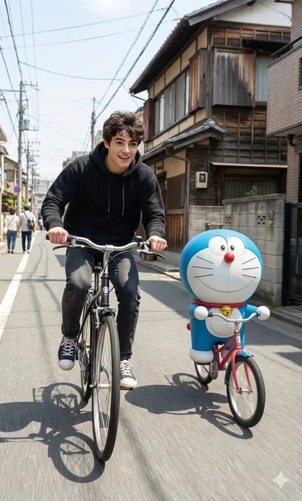
A hyper-realistic moment of a sunny Japanese street youth riding a bike with Doraemon.
Create a hyper-realistic cinematic photo inspired by the reference scene exactly. Keep the same Japanese-style street with traditional houses, a clean road, bright sunny daylight, soft natural shadows, and subtle motion blur. Place the subj
电影感超写实日系机器猫骑行
Case 7720
VIDEO
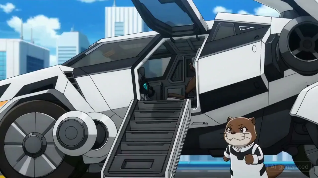
Otter drives mecha to battle marble octopus
An anime where an otter enters a large mech, with many quick shots of mechanical parts and gears turning. The otter gives a grim thumbs up, and then pilots the mech, flying into battle against an octopus made of marble.