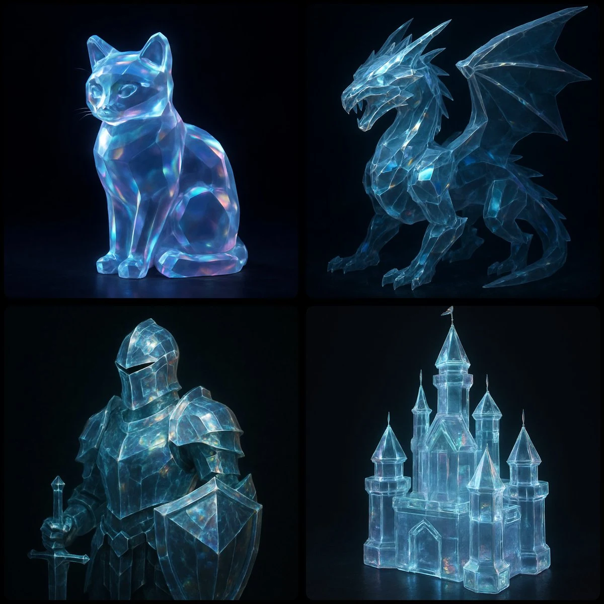
Case 13265
Minimalist Songti Chinese Traditional Culture Aesthetic Visual Guide
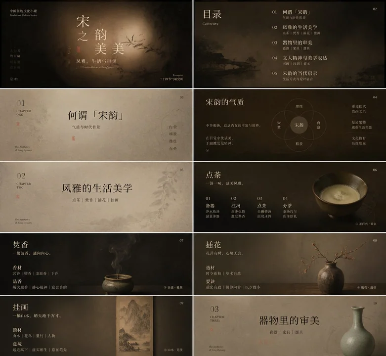
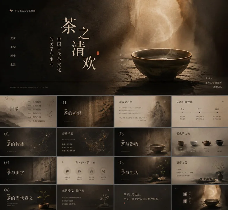
Prompt
Convert this aesthetic into a transferable visual generation style: The composition should not rely on clear objects to grab attention; instead, let the subject, information, or product slowly emerge from a warm, time-worn texture. Maintain low saturation, low noise, and soft-focus tonal depth throughout. The background may be wood grain, paper fiber, leather, clay, smoke, fabric, rock surfaces, food texture, data base maps, or abstract spaces, but all should present tactile thickness, a subtle sense of rotation, and darkened edges, making the center seem gently lifted by restrained, diffused light. Avoid template-like posters, and do not let decoration overpower the content; all elements should feel naturally deposited—quiet, mature, subtle, and memorable.

Text is the primary shaping force of the image. The Chinese title should use a slender, lean, breathable Song typeface or convey a bookish temperament, with slightly loose letter spacing and airy line spacing. Allow words to be split, misaligned, or layered, so the text blocks resemble a group of floating specimens or fallen leaves—not perfectly aligned, yet possessing inner order. Use lighter serif or narrow fonts for English, numbers, notes, and small labels as rhythmic pauses and marginalia; they should occupy little area but be precisely positioned. Create contrast in size, language, and light/dark between the main title and subtitle: large Chinese characters carry emotion and poetic quality; small English or numbers carry explanation, time, category, ranking, indicators, sources, or a faint rational echo. A minimalist symbolic graphic, line, leaf, dot, emblem, or data marker may be added as a visual turning point; do not make cute icons, and do not let them steal the weight of the text.

Organize the color system with “dark air + warm subject + low-light text + small-area semantic highlights.” Preserve the light-dark relationships and soft boundaries among amber brown, caramel brown, smoky black, and rice white from the reference image, but let the colored parts shift roles according to the actual content: for knowledge, reports, finance, and technology themes, make accent colors cooler, cleaner, and more like shimmer annotations; for food, lifestyle, solar terms, and cultural themes, make them warmer, oilier, or more paper-like; for medical, environmental, and public welfare themes, make them cleaner, paler, and more breathable; for commercial launches or cover themes, make them sharper and more concentrated, occupying only a tiny area. Large color areas in the background should always remain restrained; do not let accent colors spread into full-screen decoration, but instead let them carry emotional shifts near title junctions, key figures, legends, labels, buttons, or visual focal points. Text colors should be ivory white, aged-paper white, pale gray-gold, or misty light tones; retain detail in dark areas and avoid hard cuts of pure black or pure white.

The layout adopts an order of central concentration with quiet surroundings. The center of the image may hold titles, core data, product outlines, human postures, chart conclusions, or main visual objects, with slow space wrapped in dark areas around it; keep a small amount of brand, series name, chapter name, or short sentences at the top, place bracket-style notes on the sides, and use ultra-fine dividing lines, short English, footnotes, sources, indicator explanations, or a line of dense small text at the bottom to anchor the image, making the work feel both like a cover and a high-level report. The reading path enters through the large central text, pauses briefly at the graphic or accent color, and then falls to the bottom information layer; density decreases from the center to the edges; edge information should be small, stable, and precise. When used for charts and rankings, let the data be absorbed into this quiet texture, with key numbers becoming part of the poetic title; when used for PPTs or reports, let chapter titles, key conclusions, and supporting notes form a soft yet clear hierarchy; when used for products, figures, food, architecture, or natural objects, capture the outline, material, shadow, and negative space rather than copying the original subject matter. Now apply this aesthetic to my actual content, and let the image naturally grow into the form it requires.

Theme: Plan a knowledge topic suitable for this prompt style and create a PPT presentation around it, preferably focusing on a specific sub-direction of traditional Chinese culture. Minimum 10 images.

Please transform this aesthetic into a transferable visual generation method: the image should not depend on clear objects to seize attention, but let the subject, information, or product slowly reveal itself as if emerging from a warm material soaked in time. Keep the whole image low-saturation, low-noise, and softly focused in tonal layers. The background may be wood grain, paper fiber, leather, clay, smoke, fabric, rock surfaces, food textures, data base maps, or abstract spaces, but all must convey touchable thickness, a faint sense of rotation, and darkened edges, so the center feels gently lifted by restrained diffused light. Do not make template-like posters, and do not let decoration speak louder than the content; all elements should feel naturally sedimented—quiet, mature, restrained, and memorable.

Text is the main shaping force of the image. Chinese titles should use a slim, delicate, breathable Song typeface or convey a scholarly temperament, with slightly loose letter spacing and airy line spacing. Allow words to be split, staggered, or layered, so the text blocks feel like floating specimens or fallen leaves—not necessarily perfectly aligned, but with an internal order. English, numbers, annotations, and small labels should use lighter serif or narrow fonts as pauses in rhythm and marginal notes, small in area but precise in placement. Form contrasts of size, language, and light/dark between the main title and subtitle: large Chinese carries emotion and poetic quality, while small English or numbers carry explanation, time, category, ranking, indicators, sources, or a slight rational echo. A minimalist symbolic graphic, line, leaf, dot, emblem, or data marker may be added as a visual pivot, but do not make cute icons, and do not let them take away the weight of the text.

The color system should be organized as “dark atmosphere + warm subject + low-brightness text + small-area semantic highlights.” Preserve the tonal relationships and soft boundaries among amber brown, caramel brown, smoky black, and rice white in the reference image, but let the colored portions shift roles according to the actual content: for knowledge, reports, finance, and technology topics, make accent colors colder, cleaner, and more like shimmering annotations; for food, lifestyle, solar terms, and cultural topics, make them warmer, more oily, or more paper-like; for medical, environmental, and public welfare topics, make them cleaner, paler, and more breathable; for commercial launches or cover topics, make them sharper and more concentrated, occupying only a tiny area. Large color fields in the background should always be restrained; accent colors should not spread into full-screen decoration, but instead take on emotional transitions near title junctions, key figures, legends, labels, buttons, or visual focal points. Text colors should mainly be ivory white, aged-paper white, pale gray-gold, or misty light tones; preserve detail in dark areas and avoid the hard contrast of pure black and pure white.

The layout follows an order of central concentration with quiet support around it. The center may hold titles, core data, product outlines, human posture, chart conclusions, or main visual objects, with a slow space wrapped in darkness around it; reserve a small amount of branding, series names, chapter labels, or short phrases at the top, place bracketed notes at the sides, and use ultra-thin divider lines, short English, footnotes, sources, indicator explanations, or a line of dense small text at the bottom to weigh down the image, making the work feel both like a cover and a high-end report page. The reading path should enter through the large central text, pause briefly at a graphic or accent color, then descend to the lower information layer; density decreases from the center to the edges, and edge information should be small, steady, and precise. When used for charts and rankings, let the data be absorbed into this quiet texture, with key numbers becoming part of the poetic title; when used for PPTs or reports, let chapter headings, key conclusions, and auxiliary notes form a soft but clear hierarchy; when used for products, people, food, architecture, or natural objects, capture outline, material, shadow, and negative space rather than copying the original subject. Now apply this aesthetic to my actual content, and let the image naturally grow into the form it needs.

This time’s theme: plan a knowledge topic suitable for this prompt style, then create a PPT courseware presentation around it, preferably focused on a specific subfield of traditional Chinese culture.

At least 10 images.
More prompts
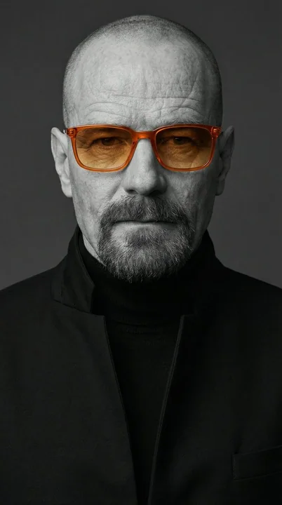
Case 11122
Minimalist black and white portrait with orange sunglasses
A studio-style close-up editorial portrait of a person with strong, well-defined facial features and slightly imperfect, natural skin texture. The subject wears a black tailored turtleneck with sharp, clean lines, layered under a high-colla
人像时尚极简黑白墨镜
Case 173
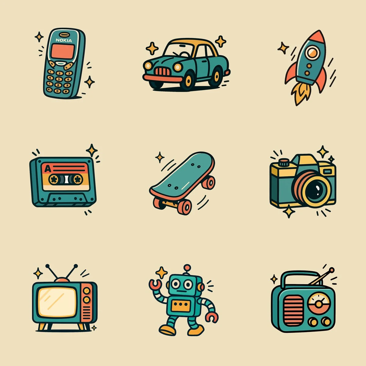
Retro Style Icons
Create an illustration of a [OBJECT] in a retro cartoon style. Use only flat, solid colors with no gradients, smudging, airbrushing, or blur. All shading and highlights should be made from clean, separate color blocks. Outline all shapes wi
illustration