Case 13072
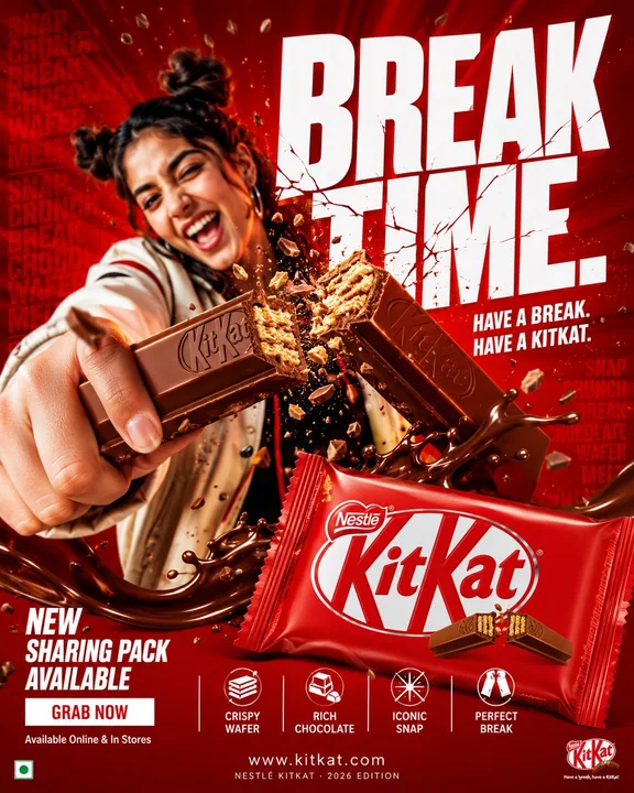
Creative chocolate commercial photography poster prompt
Prompt
Change details.
FORMAT:
4:5 vertical hyper-commercial chocolate campaign poster, ultra-high resolution (8K), premium billboard + social media advertising standard
Style: bold FMCG advertising × modern snack campaign × energetic commercial poster design × high-impact product photography

CORE IDEA:
THE MOMENT EVERYONE WAITS FOR.

A campaign built around impact, craving, and satisfying motion.
Everything in the composition reacts to the iconic KitKat snap.

MASTER COMPOSITION:
BACKGROUND: Deep KitKat red environment
Layers include:
- rich red gradients
- chocolate texture overlays
- dynamic motion streaks
- subtle crumb particles
- repeated typography patterns
- glossy studio reflections

The atmosphere should feel: bold, tempting, energetic, commercially explosive.

HUMAN SUBJECT:
Young Gen-Z male/female model
Expression: playful, confident, immersed in enjoyment
Pose: holding KitKat toward the camera, in the middle of the snapping action
Camera angle: slightly low + close-up perspective to emphasize product dominance
Wardrobe: modern streetwear in neutral tones, allowing the red palette to dominate

VISUAL ENERGY:
The “snap” becomes the visual explosion point.
At the breaking point:
- chocolate shards flying outward
- wafer crumbs suspended in mid-air
- liquid chocolate streaks
- motion lines radiating from the break point

Typography physically cracks apart following the KitKat break.
Feels: satisfying, punchy, commercially exaggerated.

PRODUCT HERO:
KitKat chocolate bar + wrapper
Placement: foreground center-right
Angle: extreme 3/4 hero perspective
Product details:
- hyper-real chocolate texture
- visible wafer layers
- glossy flowing chocolate highlights
- realistic crumbs
- embossed KitKat logo
- premium wrapper reflections

Chocolate should feel: crispy, rich, irresistible.

TYPOGRAPHY SYSTEM:
MAIN HEADLINE:
“BREAK TIME.”

Typography style:
- ultra-bold condensed sans-serif
- oversized stacked layout
- white typography
- extremely tight spacing
- cracked/distorted around the snap point

SECONDARY TEXT:
“HAVE A BREAK. HAVE A KITKAT.”

BACKGROUND TYPOGRAPHY:
Repeated low-opacity words: SNAP, CRUNCH, BREAK, CHOCOLATE, WAFER, MELT, integrated into the background layers.

FEATURE INFORMATION STRIP:
Bottom premium feature strip:
□ CRISPY WAFER □ RICH CHOCOLATE □ ICONIC SNAP □ PERFECT BREAK
Minimal modern icon system.

CALL TO ACTION (CTA) SECTION:
BOTTOM LEFT:
“NEW SHARING PACK AVAILABLE”
CTA BUTTON: solid white rectangular button
TEXT: “BUY NOW”
Secondary micro CTA: “Available Online & In Stores”

WEBSITE + BRAND INFO:
BOTTOM CENTER:
www.kitkat

BOTTOM MICROTEXT:
“NESTLÉ KITKAT · 2026 EDITION”

COLOR SYSTEM:
PRIMARY: KitKat red, deep chocolate brown
SECONDARY: white typography
ACCENTS: warm chocolate highlights, golden wafer tones
The palette should feel: bold, delicious, high-energy, commercial.

LIGHTING SYSTEM:
MAIN LIGHT: strong commercial studio key light
RIM LIGHT: warm chocolate highlights around the product
ACCENT LIGHT: soft red glow behind the snap action
AMBIENT LIGHT: subtle floating particles catching light
REFLECTIONS: glossy FMCG-grade reflections

Lighting should feel: premium snack advertising × modern commercial photography.

HYPER DETAILING:
- ultra-real wafer texture
- sharp chocolate break detail
- realistic floating crumbs
- melted chocolate reflections
- premium wrapper texture
- maintained billboard readability
- ultra-clean typography edges
- high-end FMCG rendering quality

COMPOSITION FLOW:
Upper frame: massive typography dominance
Center: snap explosion + human interaction
Foreground: product hero
Lower-left: CTA + features

Eye flow: Headline → Snap → Product → Chocolate Motion → CTA

CAMERA & RENDER:
- commercial food photography
- Phase One medium format feel
- 35–50mm lens
- HDR commercial rendering
- ultra-clean sharpness
- premium FMCG color grading

FINAL FEEL:
Feels like: Nike energy campaign × premium FMCG launch × modern Behance commercial food poster.
More prompts
Case 14872
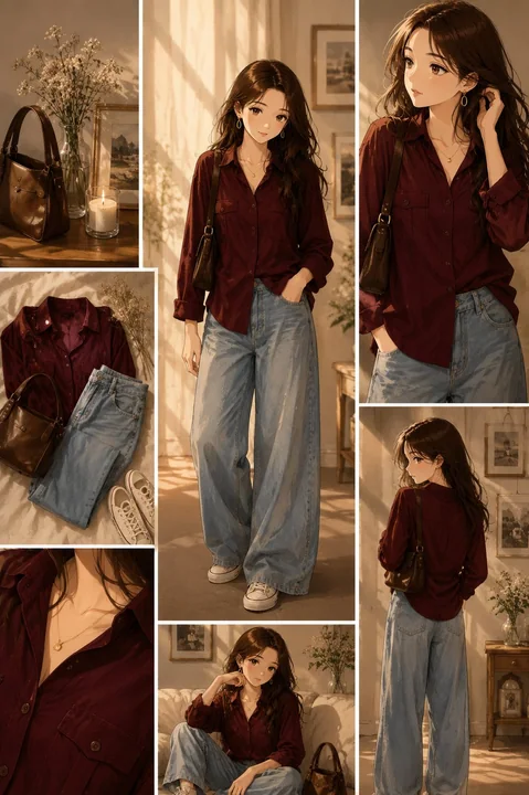
Hyper-realistic anime fashion outfit collage
Ultra-realistic anime fashion lookbook collage, warm golden-hour sunlight streaming through large windows, cozy luxury apartment interior with soft beige walls, framed artwork, flowers in glass vases, candlelight ambiance, elegant feminine
Case 7
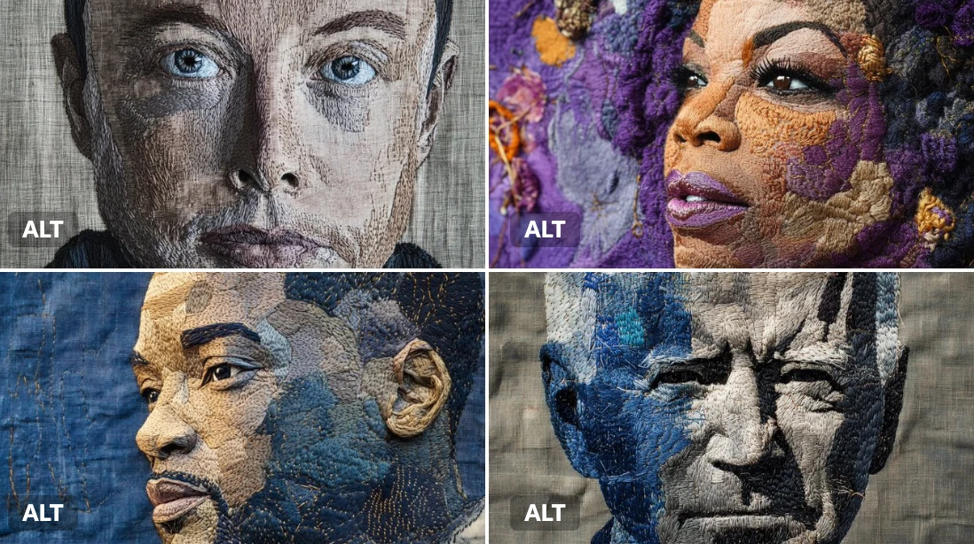
Embroidered portrait
An embroidered portrait of [subject], [colors] thread on deep linen fabric. Visible needlework, layered textures, and handmade patterns give it an earthy, sacred feel. An embroidered portrait of Elon Musk, stitched with rich steel grey and
portrait
Case 20